
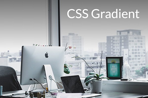
이미지 위의 글자나 캡션은 전경 요소와 배경의 색 대비에 따라 읽기 어려울 때가 있습니다. 저는 HTML 텍스트가 눈에 띄고 읽기 쉽도록 이미지를 더 어둡게 또는 밝게 편집하곤 했지만, CSS 몇 줄로 훨씬 쉽게 해결하는 방법이 있습니다!
원본
CSS 그라데이션
HTML
아래 코드를 복사해서 HTML 문서에 붙여넣으세요.
<div class="hero-outer">
    <div class="hero-inner">
        <p>CSS Gradient</p>
    </div>
</div>
CSS
아래 코드를 복사해서 CSS 문서에 붙여넣으세요.
.hero-outer { position:relative; }
.hero-inner::after {
    content: '';
    position: absolute;
    top: 0;
    left: 0;
    width: 100%;
    height: 50%;
    background-image: linear-gradient(to bottom, #000, transparent);
    opacity: 0.5;
}
.hero-inner {
    background: url('https://identitydesign.us/wp-content/uploads/2026/11/300x200-gradient-1.jpg');
    width:100%;
    height: 400px;
    background-size:cover;
}
.hero-inner p {
    color:#fff;
    position:relative;
    font-size: 50px !important;
    padding-right: 40px;
    text-align: right;
    top: 20px;
    z-index: 1;
}