
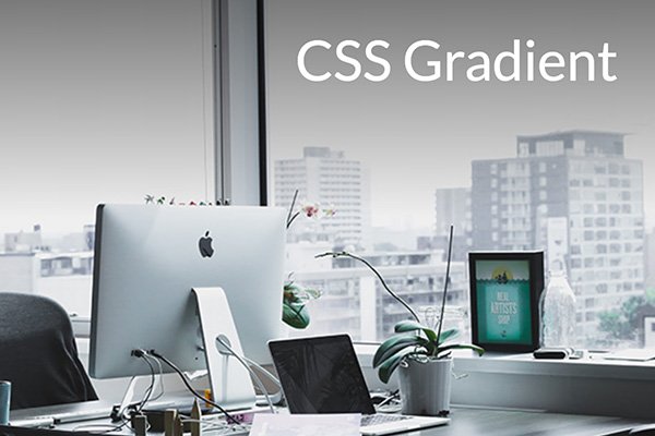
Sometimes the text or caption on an image is not legible, depending on the color contrast between the foreground element and the background. I used to edit my image to make it darker or lighter so the HTML text would stand out and be readable to users, but here’s a much easier solution with a few lines of CSS!
Original
CSS Gradient
HTML
Copy the code below and paste it into your HTML document.
<div class="hero-outer">
    <div class="hero-inner">
        <p>CSS Gradient</p>
    </div>
</div>
CSS
Copy the code below and paste it into your CSS document.
.hero-outer { position:relative; }
.hero-inner::after {
    content: '';
    position: absolute;
    top: 0;
    left: 0;
    width: 100%;
    height: 50%;
    background-image: linear-gradient(to bottom, #000, transparent);
    opacity: 0.5;
}
.hero-inner {
    background: url('https://identitydesign.us/wp-content/uploads/2026/11/300x200-gradient-1.jpg');
    width:100%;
    height: 400px;
    background-size:cover;
}
.hero-inner p {
    color:#fff;
    position:relative;
    font-size: 50px !important;
    padding-right: 40px;
    text-align: right;
    top: 20px;
    z-index: 1;
}